In the vast realm of branding and marketing, few elements carry as much weight and significance as color. It’s not just about aesthetics; color plays a pivotal role in how a brand is perceived, remembered, and even how it performs in the market. In this article, we’ll explore the profound impact of color in logos and branding, delving into the psychology of colors and their industry-specific applications.
The Psychology of Color
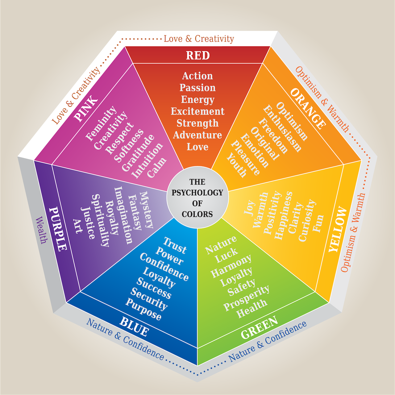
Every color evokes a specific emotion or set of emotions in the viewer. Understanding these associations is crucial for brands aiming to convey a particular message or sentiment. Here’s a brief overview:
Industry-Specific Color Choices
Certain industries gravitate towards specific colors due to the emotions and perceptions they wish to evoke in their target audience:
These logos, with their distinct color choices, have become symbols in their own right, representing not just the companies they stand for but also the values and emotions associated with those brands.
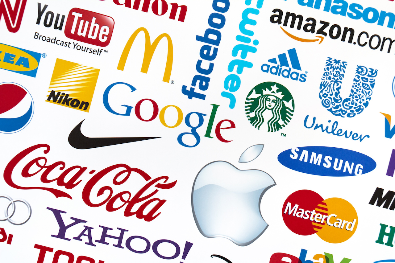

The Apple logo, a simple apple silhouette with a bite taken out, has seen various color iterations over the years. Originally, it was a rainbow-colored apple, representing the company’s innovation in color displays. Today, it’s often monochromatic, symbolizing simplicity and elegance.
The Nike Swoosh is a simple, curved checkmark representing motion and speed. It’s typically black or white, emphasizing simplicity and versatility.

The golden arches of McDonald’s are instantly recognizable. The yellow color is warm and inviting, symbolizing happiness and friendliness.
The Coca-Cola script logo is red, a color that evokes excitement, energy, and passion. It’s a color that grabs attention and is associated with the brand’s lively image.

The silver star enclosed in a circle is a symbol of luxury and elegance. Silver is often associated with sophistication and modernity.

The three stripes of Adidas, often in black or white, represent performance, durability, and excellence.

Known as the “Big Blue”, IBM’s blue logo represents trust, reliability, and stability.

The green mermaid logo of Starbucks is associated with freshness, growth, and prosperity.
The Pepsi globe has red, white, and blue colors. While it has seen many redesigns, the color choice often evokes feelings of excitement (red), purity (white), and trustworthiness (blue).

The Google logo uses blue, red, yellow, and green. Each color is vibrant and playful, aligning with the company’s innovative and dynamic image.
Color is not just a design choice; it’s a powerful branding tool that can make or break a brand’s perception in the market. By understanding the psychology behind colors and their industry-specific applications, brands can craft logos and branding strategies that resonate deeply with their target audience, ensuring lasting impressions and loyalty.
Remember, while trends come and go, the fundamental principles of color psychology remain. So, the next time you’re evaluating a logo or branding decision, consider not just what looks good, but what feels right.
Dooley & Associates is the leading branding and marketing agency in Kenosha, Wisconsin, committed to crafting impactful brands and meaningful identities in the Midwest and beyond. For more insights and expert advice, get in touch with us today.


